Interactive Maps

Click on the different Census Tracts to see each percentage!
You can also switch between year by hovering over the white box in the right corner of the map.

IPUMS NHGIS, University of Minnesota, www.nhgis.org; U.S. Census Bureau, Decennial Census 2000-2010; 1920 United States Census, Ancestry.com

Here are some of the most important items when comparing the maps from 1920 to 2010:

  • First, it is important to note that the 1920 map depicts Enumeration Districts (which are smaller area units) instead of Census Tracts, as that data was not readily available. While the comparison to the other maps is a little different based on the size of the areas, this 1920 map allows for us to see which areas had African Americans living before the creation of the HOLC redlining maps and federally approved segregation. You can see, that spme of the areas that had higher concentrations of African Americans are the same that were segregated with redlining, while other areas either shifted to being more white or became smaller and more concentrated. Take a look and see if you can spot the biggest differences!

  • The census tracts located to the north and east of Downtown continue to the areas with the hightest concentration of African Americans between 1940 and 2010.

  • The census tracts located directly west of Downtown and some in the south have stayed predominatly white since the 1940s.

  • The areas that have been predominatly African American concentrated are located within the areas of large renewal projects, most notably, the construction of I-235. If you zoom in closer, you can see exactly the census tracts where I-235 has gone through.

  • Even as the census tracts expand and change due to shifting boundaries, it is apparent that a legacy has been left on Des Moines's landscape because of the policies and laws put into place back in the early 20th century.

  • If you take a look at the 1936 HOLC Redlining Map below or on the interactive map above, you should notice that the areas that today are predominately concentrated by African Americans are the same areas once redlined. This legal segregation in the 1930s caused the City of Des Moines to be forever shaped by s as the census tracts expand and change due to shifting boundaries, it is very clear that a legacy has been left on Des Moines's landscape because of the policies and laws put into place back in the early 20th century.


  • It is also essential to consider the affect redlining and segregation have had on ownership and rentership for African Americans in the City of Des Moines.

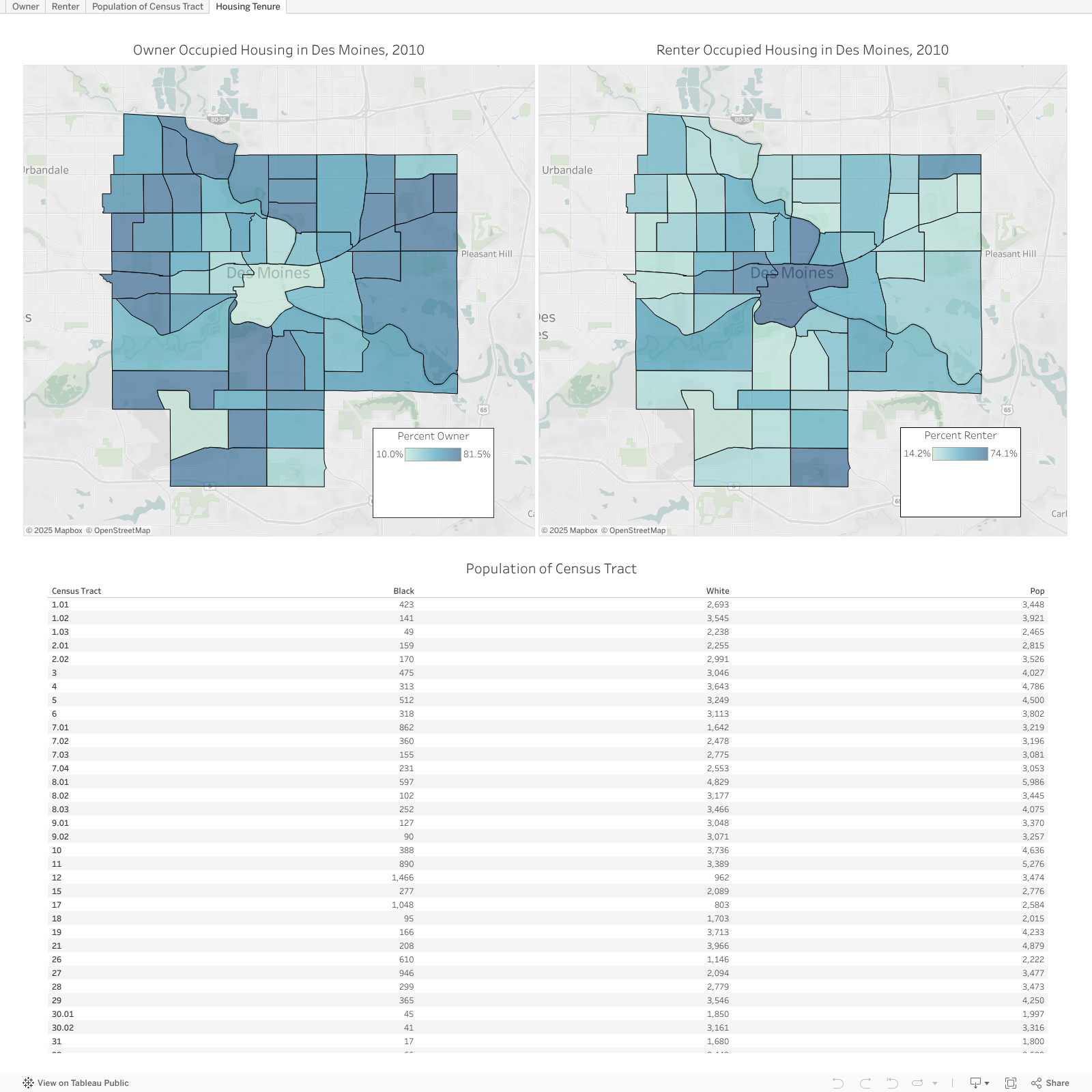
    In the maps and table below, 2010 data shows that in many of the areas that are predominately African American, there is, on average, higher rental occupancy compared to ownership. In 2017, 24% of African American residents looking to get a loan to buy a home in Des Moines were denied compared to the average of 11.3% denial rate for all of Polk County (AALFDSM, 2017). In an interview, Mr. Clair Rudison, Jr. noted that the neighborhoods north of Downtown, including Evelyn Davis Park, Cheatom Park, and River Bend, have seen a significant shift in the housing tenure. “Back in the sixties the places looked nicer than they do today because back then majority of blacks that lived over here owned their own properties, today they don’t.” The change in tenure is a good indication of the wealth disparity in a community, and it is evident, based on the data and mapped visuals that the areas with higher amounts of renters are the areas with predominantly more African Americans and minorities.


    This research does not explore at length the relationship between rental/owner units and where African Americans are located, but it is research that should be done. Building equity and wealth is an important part of American society and minorities, especially African Americans, have been restricted in their access to those opportunities.


    Redlining also impacts the built environment itself

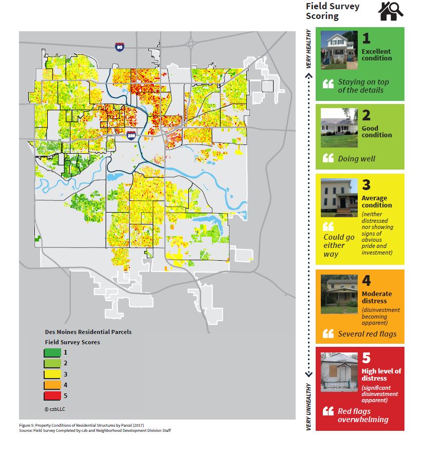
    Redlining has not only left a distinct influence as to where African Americans have lived over time, rather it has also significantly impacted the built environment itself. It is apparent today that the areas with higher concentrations of African Americans have not been invested in overtime and will unlikely see lots of positive investment in the future. The housing and streets themselves are more rundown and, while the community does care about their neighborhoods because so much of the housing stock has become rental properties, the maintenance of the exterior is not kept up regularly. In the images below, you can see that the areas of higher risk and minority concentration have become areas of depleted housing stock, decreasing housing values and decreasing neighborhood "health", which can be observed in the photos below.

    Neighborhood Type
    Smart City Framework
    Smart City Framework

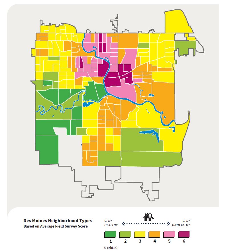
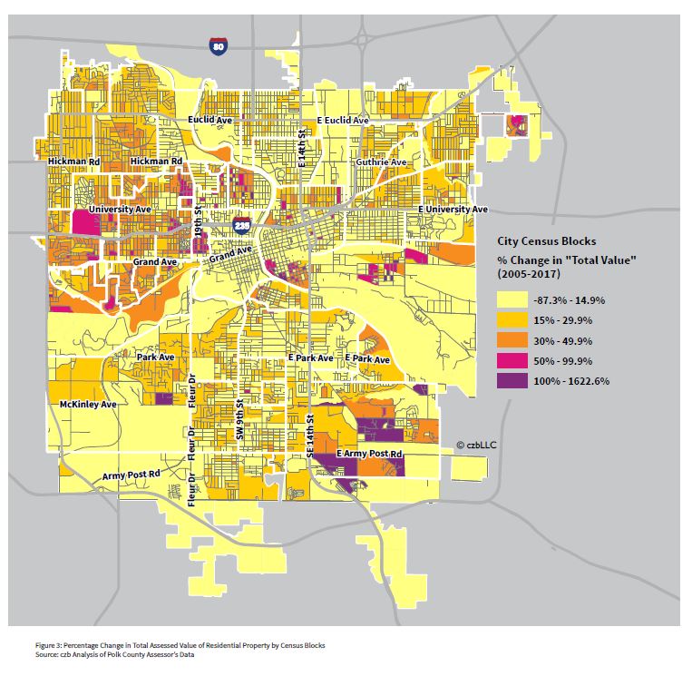
    It is evident from these maps produced by czb LLC in 2018, that there has been little to no investment into the communites that have been predominatly African American and low-income. They recognize that these places are deteriorating, but yet, not much is being done to help those communities prosper. While they talk about the need for these places to change, based on maps such as these, action has not happened and these places continue to endure in poverty and run-down housing .